Matrix Plots
Matrix plots allow you to plot data as color-encoded matrices and can also be used to indicate clusters within the data (later in the machine learning section we will learn how to formally cluster data).
Let’s begin by exploring seaborn’s heatmap and clutermap:
import seaborn as sns
%matplotlib inline
flights = sns.load_dataset('flights')
tips = sns.load_dataset('tips')
tips.head()
| total_bill | tip | sex | smoker | day | time | size | |
|---|---|---|---|---|---|---|---|
| 0 | 16.99 | 1.01 | Female | No | Sun | Dinner | 2 |
| 1 | 10.34 | 1.66 | Male | No | Sun | Dinner | 3 |
| 2 | 21.01 | 3.50 | Male | No | Sun | Dinner | 3 |
| 3 | 23.68 | 3.31 | Male | No | Sun | Dinner | 2 |
| 4 | 24.59 | 3.61 | Female | No | Sun | Dinner | 4 |
flights.head()
| year | month | passengers | |
|---|---|---|---|
| 0 | 1949 | January | 112 |
| 1 | 1949 | February | 118 |
| 2 | 1949 | March | 132 |
| 3 | 1949 | April | 129 |
| 4 | 1949 | May | 121 |
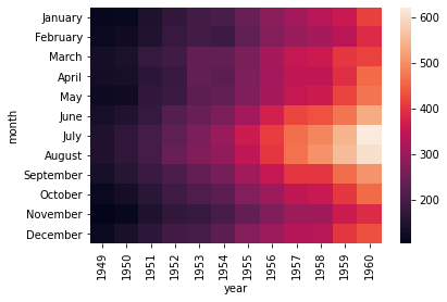
Heatmap
In order for a heatmap to work properly, your data should already be in a matrix form, the sns.heatmap function basically just colors it in for you. For example:
tips.head()
| total_bill | tip | sex | smoker | day | time | size | |
|---|---|---|---|---|---|---|---|
| 0 | 16.99 | 1.01 | Female | No | Sun | Dinner | 2 |
| 1 | 10.34 | 1.66 | Male | No | Sun | Dinner | 3 |
| 2 | 21.01 | 3.50 | Male | No | Sun | Dinner | 3 |
| 3 | 23.68 | 3.31 | Male | No | Sun | Dinner | 2 |
| 4 | 24.59 | 3.61 | Female | No | Sun | Dinner | 4 |
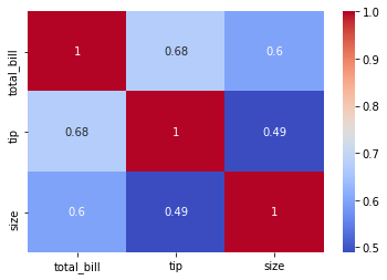
# Matrix form for correlation data
tips.corr()
| total_bill | tip | size | |
|---|---|---|---|
| total_bill | 1.000000 | 0.675734 | 0.598315 |
| tip | 0.675734 | 1.000000 | 0.489299 |
| size | 0.598315 | 0.489299 | 1.000000 |
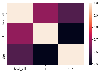
sns.heatmap(tips.corr())
<matplotlib.axes._subplots.AxesSubplot at 0x7f589fdd5a10>
sns.heatmap(tips.corr(),cmap='coolwarm',annot=True)
<matplotlib.axes._subplots.AxesSubplot at 0x7f586fac2b90>
Or for the flights data:
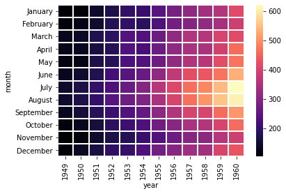
flights.pivot_table(values='passengers',index='month',columns='year')
| year | 1949 | 1950 | 1951 | 1952 | 1953 | 1954 | 1955 | 1956 | 1957 | 1958 | 1959 | 1960 |
|---|---|---|---|---|---|---|---|---|---|---|---|---|
| month | ||||||||||||
| January | 112 | 115 | 145 | 171 | 196 | 204 | 242 | 284 | 315 | 340 | 360 | 417 |
| February | 118 | 126 | 150 | 180 | 196 | 188 | 233 | 277 | 301 | 318 | 342 | 391 |
| March | 132 | 141 | 178 | 193 | 236 | 235 | 267 | 317 | 356 | 362 | 406 | 419 |
| April | 129 | 135 | 163 | 181 | 235 | 227 | 269 | 313 | 348 | 348 | 396 | 461 |
| May | 121 | 125 | 172 | 183 | 229 | 234 | 270 | 318 | 355 | 363 | 420 | 472 |
| June | 135 | 149 | 178 | 218 | 243 | 264 | 315 | 374 | 422 | 435 | 472 | 535 |
| July | 148 | 170 | 199 | 230 | 264 | 302 | 364 | 413 | 465 | 491 | 548 | 622 |
| August | 148 | 170 | 199 | 242 | 272 | 293 | 347 | 405 | 467 | 505 | 559 | 606 |
| September | 136 | 158 | 184 | 209 | 237 | 259 | 312 | 355 | 404 | 404 | 463 | 508 |
| October | 119 | 133 | 162 | 191 | 211 | 229 | 274 | 306 | 347 | 359 | 407 | 461 |
| November | 104 | 114 | 146 | 172 | 180 | 203 | 237 | 271 | 305 | 310 | 362 | 390 |
| December | 118 | 140 | 166 | 194 | 201 | 229 | 278 | 306 | 336 | 337 | 405 | 432 |
pvflights = flights.pivot_table(values='passengers',index='month',columns='year')
sns.heatmap(pvflights)
<matplotlib.axes._subplots.AxesSubplot at 0x7f5855917d90>
sns.heatmap(pvflights,cmap='magma',linecolor='white',linewidths=1)
<matplotlib.axes._subplots.AxesSubplot at 0x7f584c1f3f90>
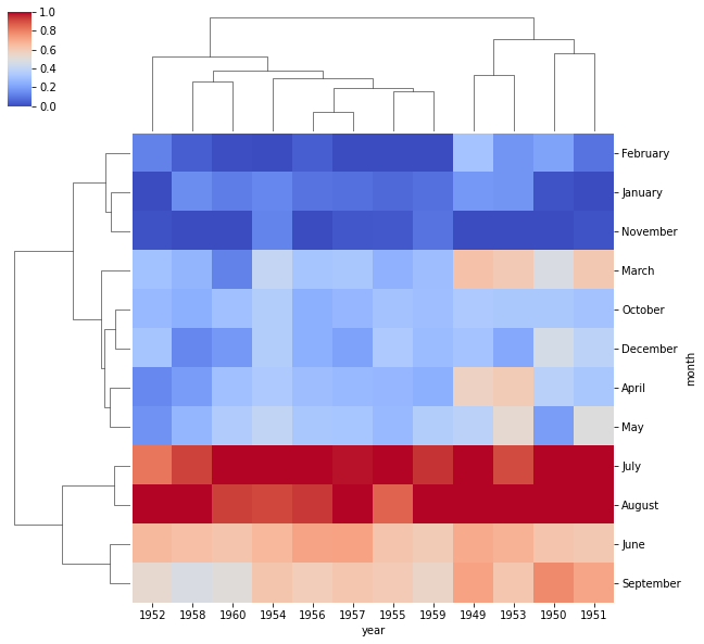
Clustermap
The clustermap uses hierarchal clustering to produce a clustered version of the heatmap. For example:
sns.clustermap(pvflights)
<seaborn.matrix.ClusterGrid at 0x7f584c1b19d0>
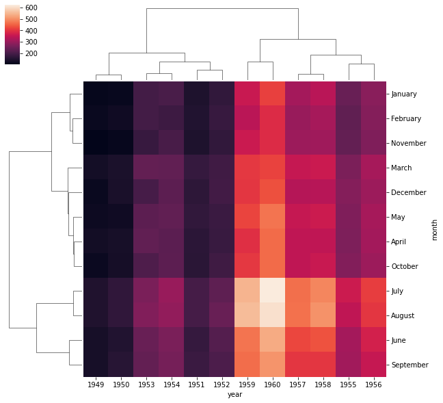
Notice now how the years and months are no longer in order, instead they are grouped by similarity in value (passenger count). That means we can begin to infer things from this plot, such as August and July being similar (makes sense, since they are both summer travel months)
# More options to get the information a little clearer like normalization
sns.clustermap(pvflights,cmap='coolwarm',standard_scale=1)
<seaborn.matrix.ClusterGrid at 0x7f584c1053d0>